Topic thumbnail

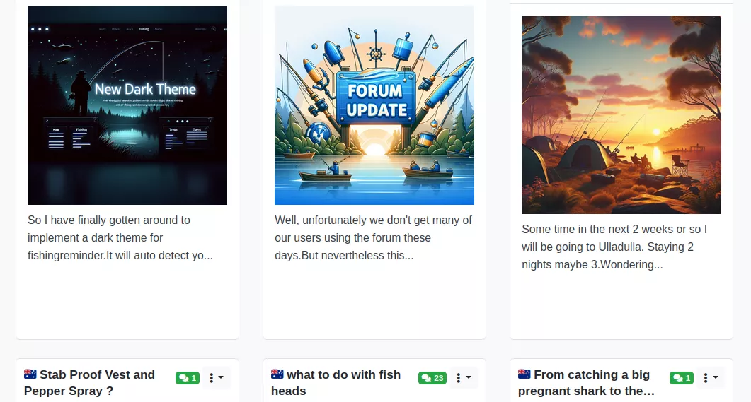
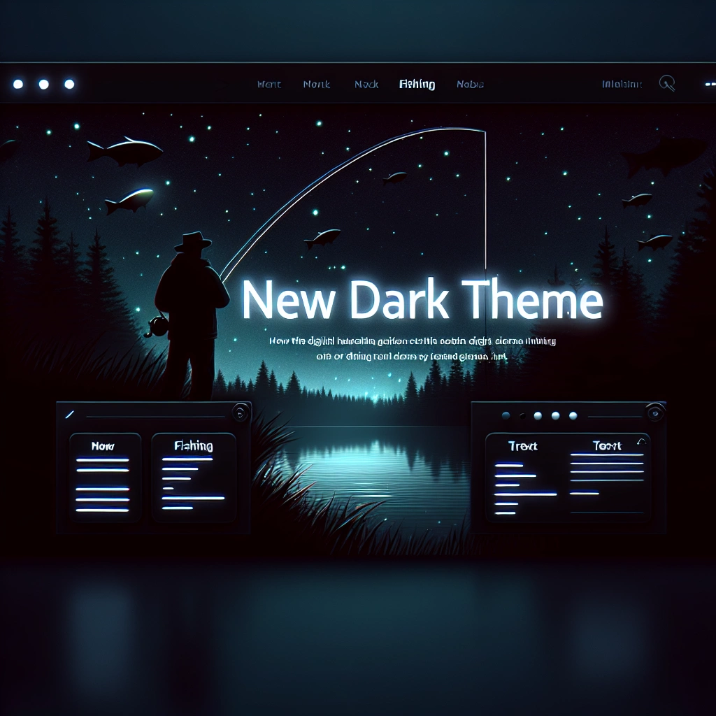
New Dark Theme

So I have finally gotten around to implement a dark theme for fishingreminder.

It will auto detect your device setting by default.


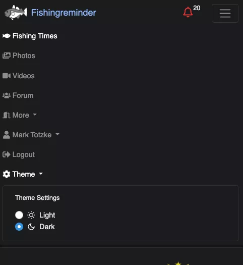
But you can change the setting in the top navigation.

There is Theme selector now. Or in the menu on mobile phones.


I hope there are not too many errors. Let me know if there are any

elements that are not properly visible. Or if anything is difficult to read or use in the dark theme. Remember you can always switch back to the light theme if you don't like it.


Cheers

Mark


Desktop:
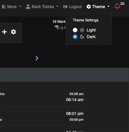

forum image


Mobile:


forum image

Likes: 2 Login to reply 3 weeks ago

Looks good...BUT you have 20 unread messages !! :) :)


Just kidding...but it does say 20 haha


Last post is now gone. The part at the bottom of each topic that shows who and when made the last post.


forum image

cheers mate, gotta catch up on my messages :)


good spotting, yep the last post was somehow hidden again. Brought it back.

Very good...


If it is anything like mine, 19 of those messages will be spam :)

haha, well there are no spam messages on the FR website 😂 Luckily we make sure of that.

But if it was my email - I sometimes don't even wanna look at it.

👍👍👍👍👍👍👈 thanks for the dark mode😀

sure thing, it was long overdue :) 🤙